A new brand identity for New Zealand AIDS Foundation
- 2020
- Strategy,
- Identity,
- Design,
- Digital,
- Marketing,
- Content
- Visit site
New Zealand AIDS Foundation is a not-for-profit organisation born out of the Rainbow community’s response to AIDS in the early 1980s. NZAF have been at the forefront of the community response to HIV in Aotearoa for more than 30 years.
The first case of the virus wasn’t recorded in New Zealand until 1984. By this stage, volunteers and community members around New Zealand had been raising awareness about HIV and AIDS for some time.
Today, NZAF connects with thousands of kiwis through their HIV prevention programmes and their HIV testing, counselling and support services around New Zealand. The core team consists of forty plus wonderful people who are passionate and driven by their work. Their national office is in Auckland; their regional centres are located in Christchurch, Wellington and Auckland. NZAF also has contract services in many other regions throughout New Zealand.

The purpose of our involvement with NZAF was to evolve their overall brand identity and digital presence. For over 28 years the NZAF brand had many iterations, resulting in a lot of inconsistencies and a surprising amount of logo variations.
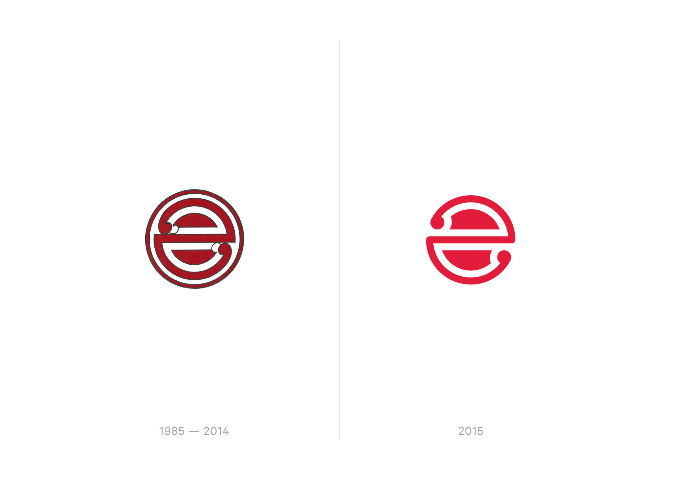
Our challenge was evolving an iconic New Zealand brand that within specific communities has profound roots. From a visual standpoint the logo, designed initially by Wellington graphic artist Chris McBride, had retained the same visual form and colour since the late 1980s.


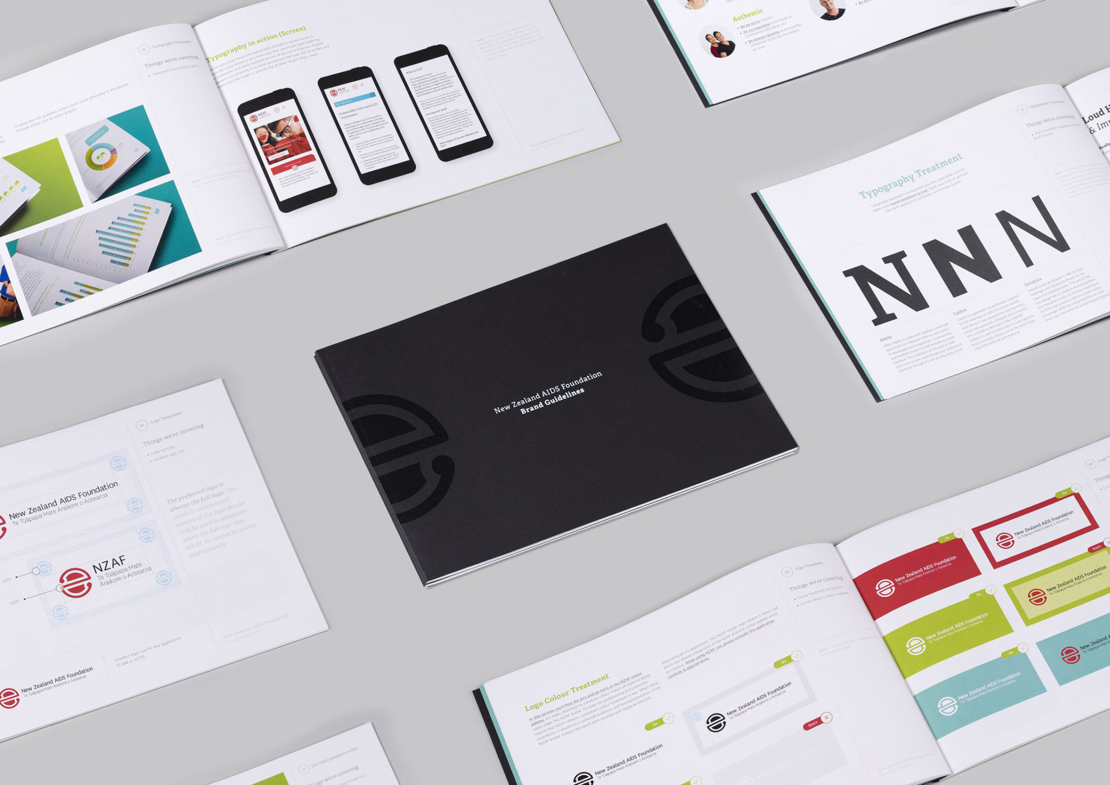
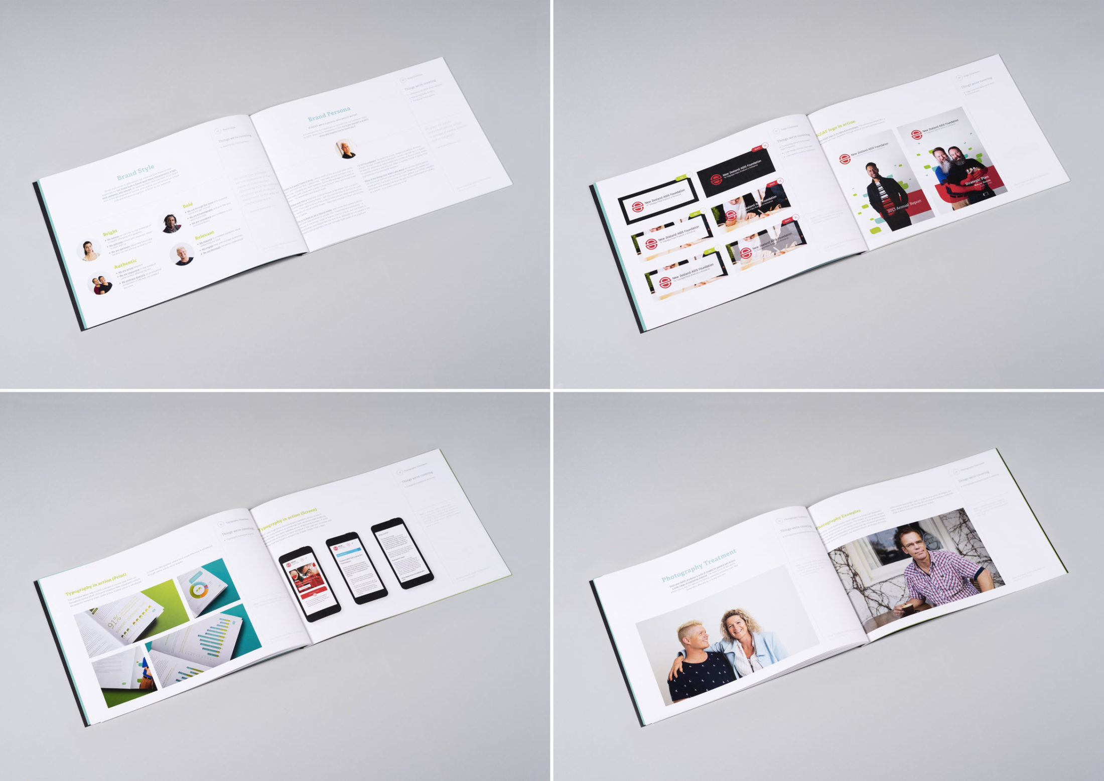
We helped create the foundation for a consistent evolved brand by working with NZAF to document their current brand position, history and values through an internal brand guidelines. This document is used as a reference point for internal reflection & creation across any piece of public-facing material.
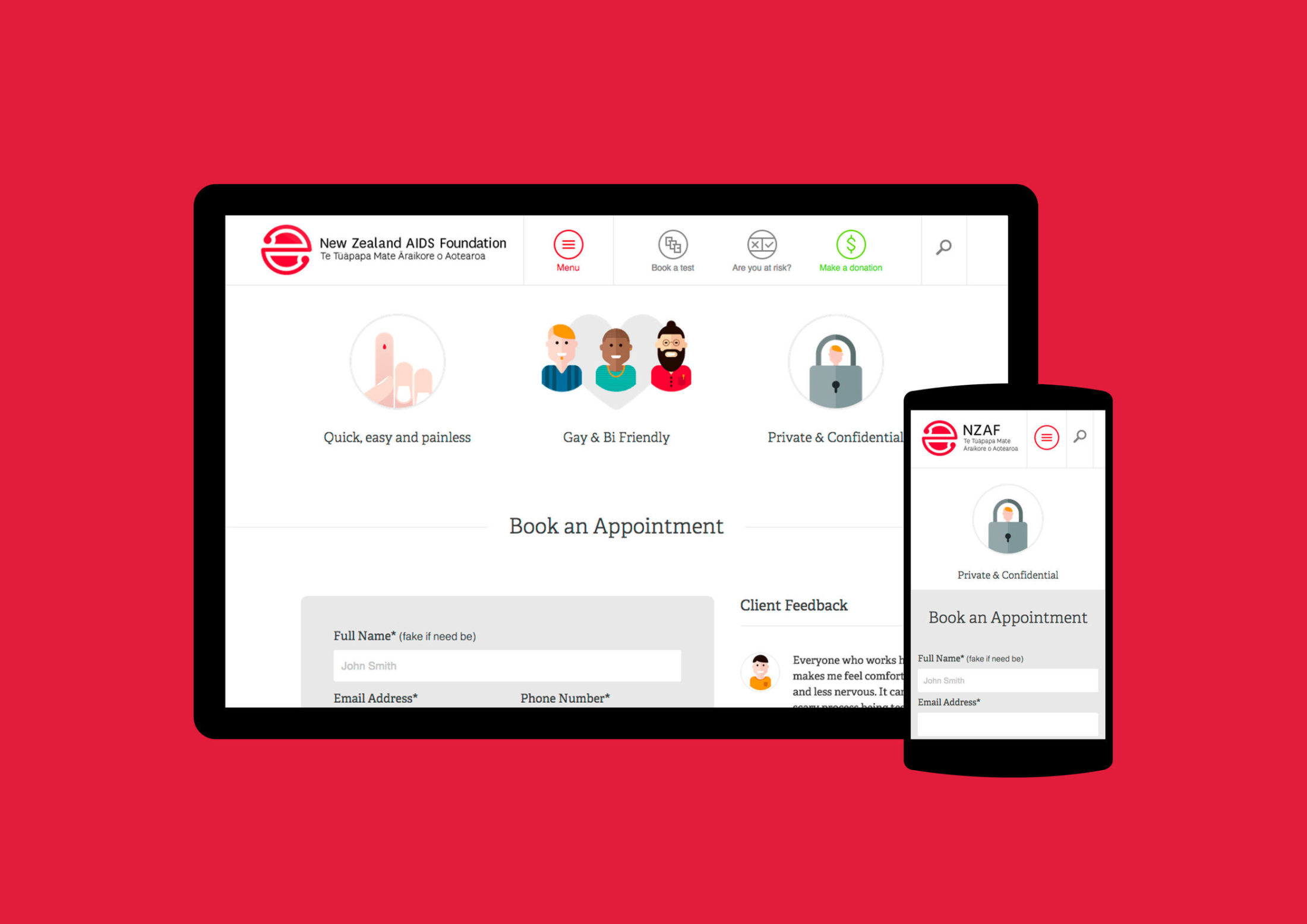
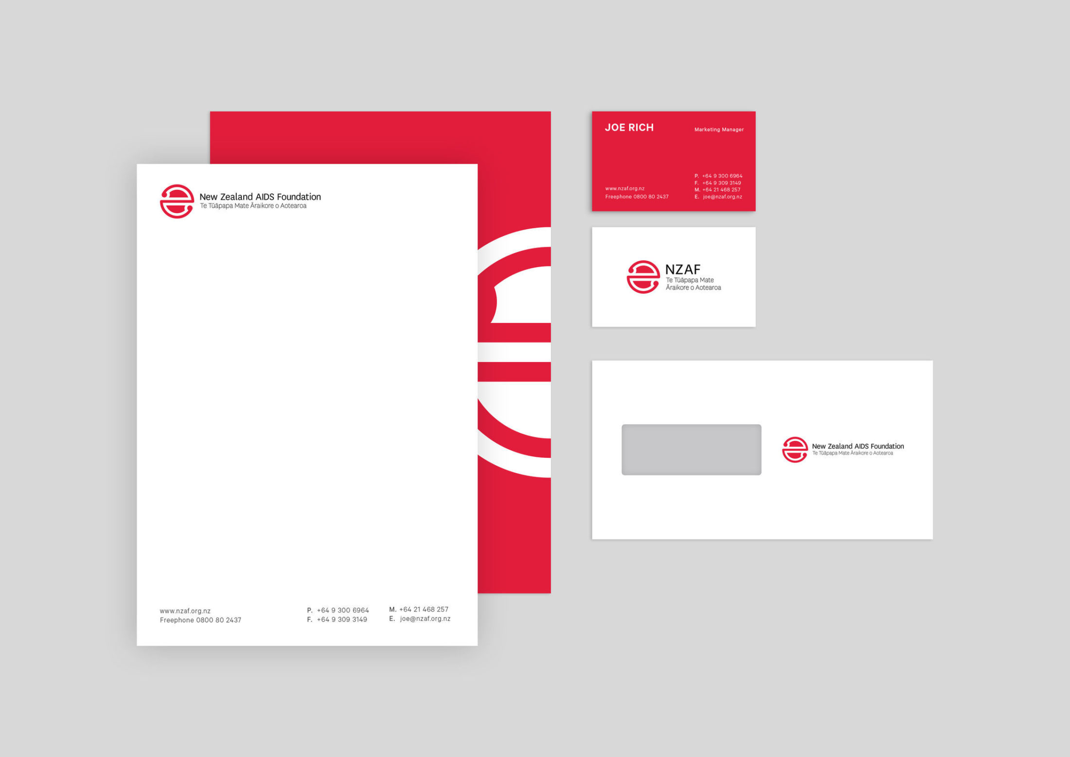
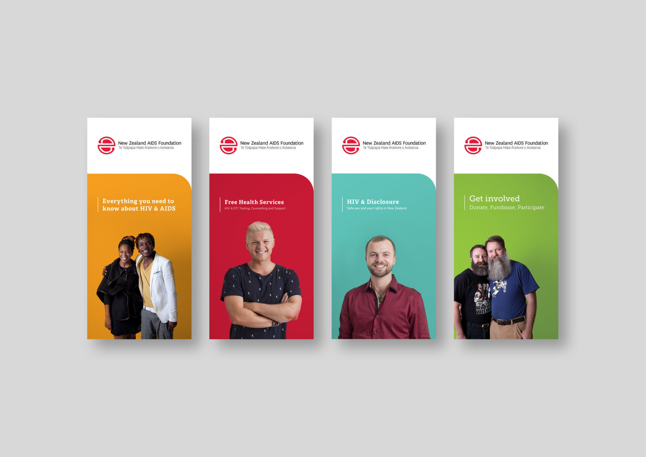
We preserved the legacy of the logo by evolving the primary form. The koru symbolises new life, growth, strength and peace. The circular form communicates the importance of tackling the epidemic of HIV as one community. The vibrant red is emotive on both the positive & negative levels. We helped develop a unified secondary colour palette to run across the more extensive brand collateral. The NZAF brand environment currently runs across print assets, their website, social media, building signage, photography, video, animation and illustration styles.

Next completed project
A new look for New Zealand's leading Agile coaching and training providers
- 2020
- Strategy,
- Identity,
- Design,
- Digital,
- Content
Nomad8 is one of New Zealand’s most recognised and valued Agile coaching and training providers. Pitch worked with Brenda and the team to lay out their brand foundations, involving a new logo mark and communication strategy, a suite of playful illustrations, high-value print pieces and a new website powered by Craft CMS.
In a space that often feels overly corporate and structured, Nomad8 offers a laidback approach to Agile allowing participants to feel themselves. It was important that this feeling was at front of mind when experiencing the Nomad8 brand, and it's something that as team members they all carry with pride — a reflection of who they are as people and as a successful business.
